Let’s Discuss
Let’s Discuss
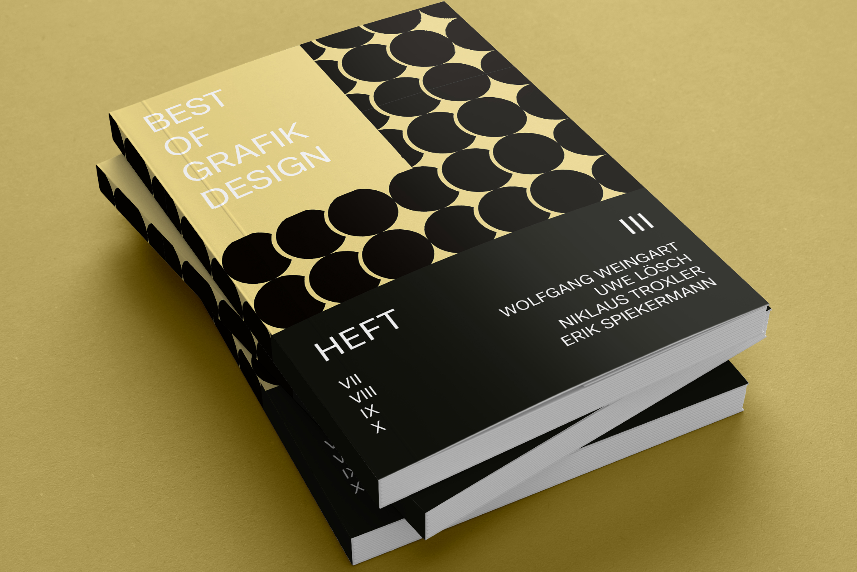
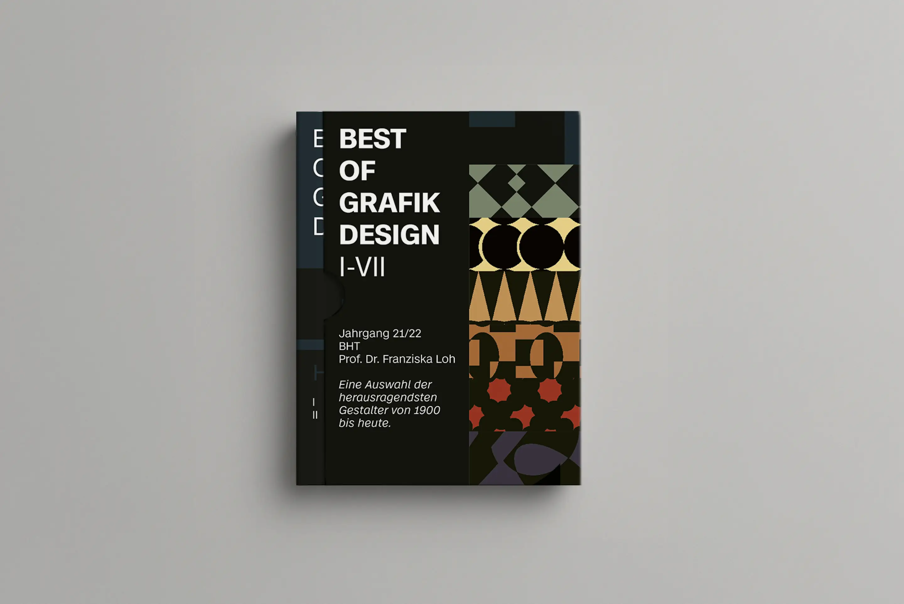
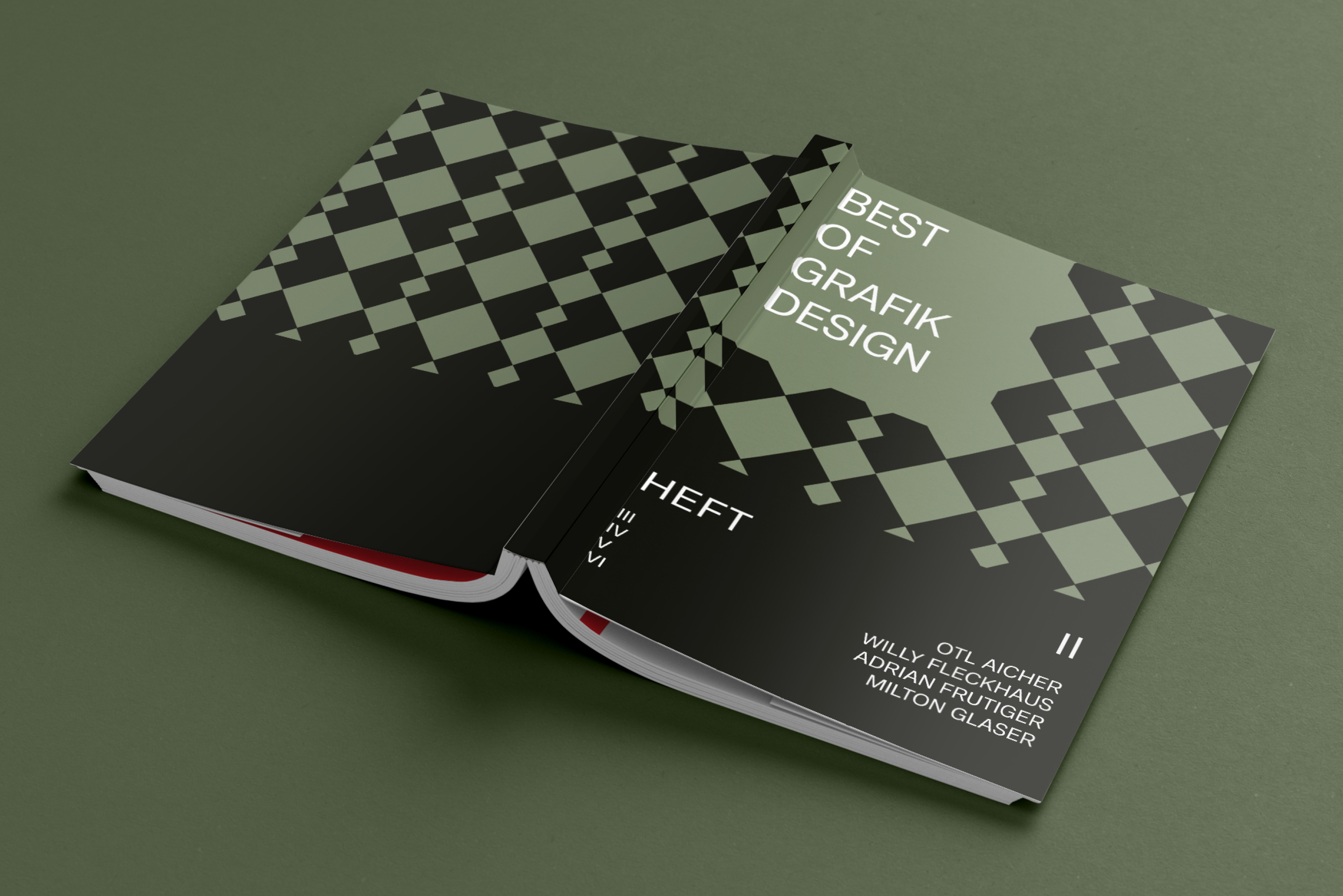
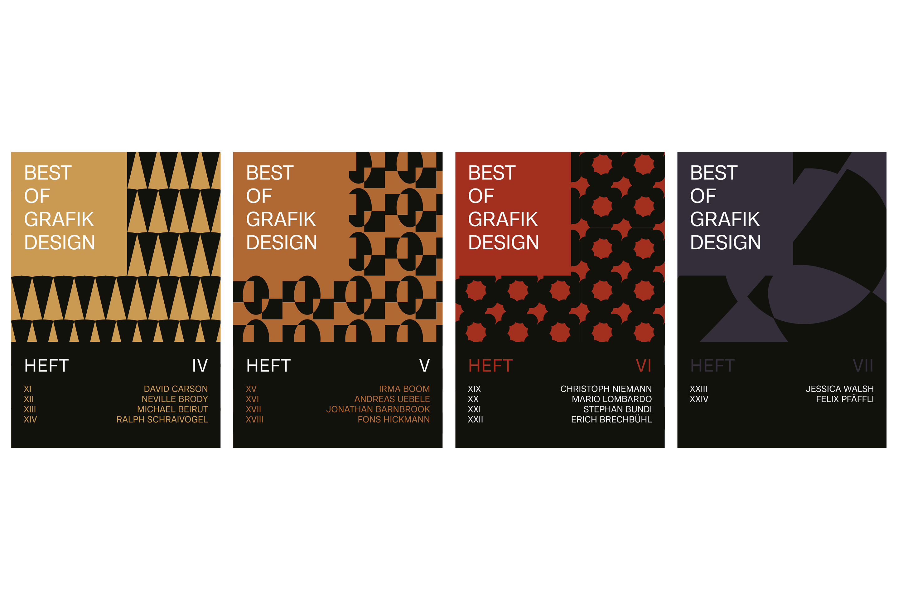
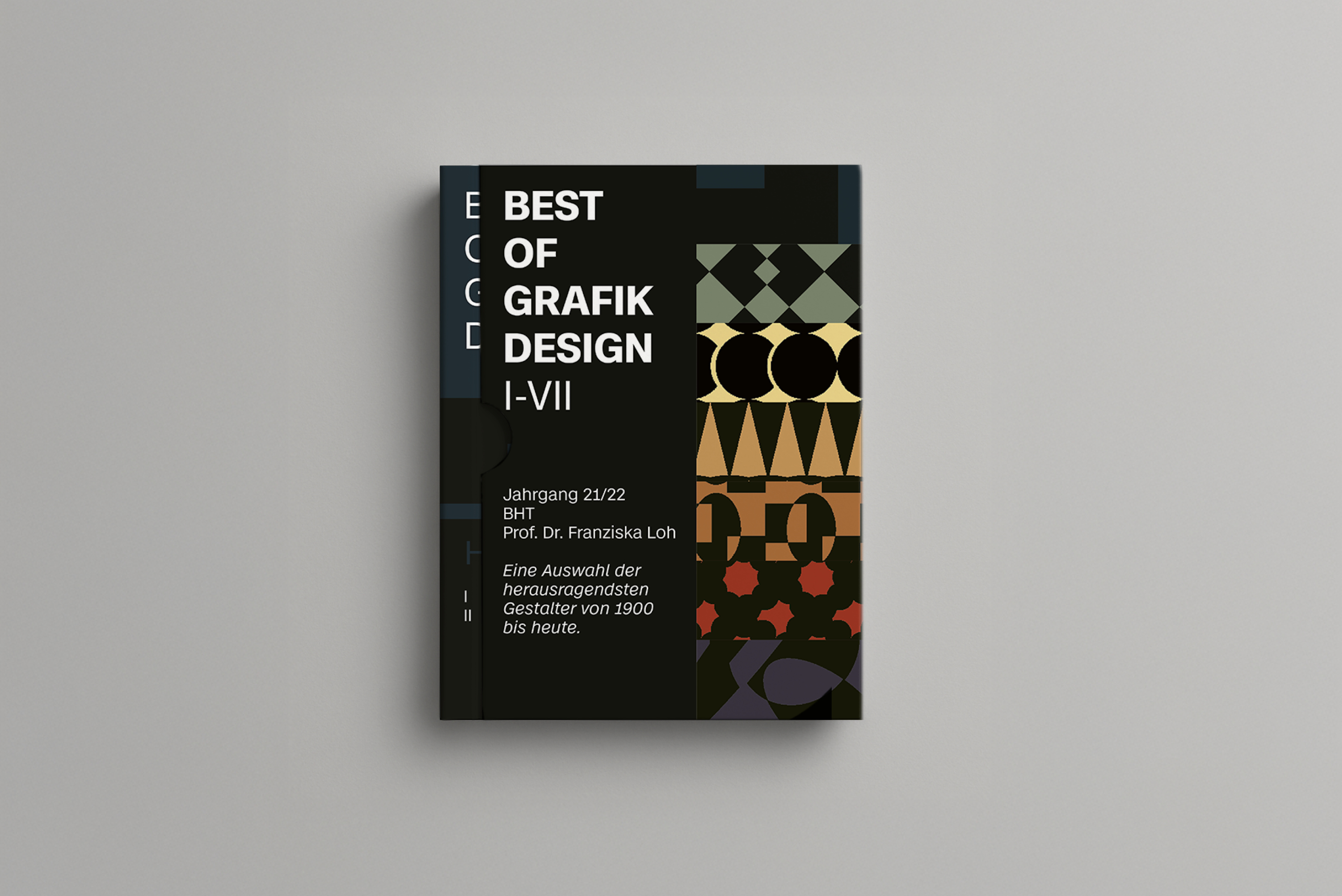
This editorial design project focused on developing a cohesive visual identity for a multi-volume print collection. The goal was to create an instantly recognizable and structured system across all editions — including covers, typography, layout hierarchy, and visual rhythm. The final design highlights both typographic discipline and bold color experimentation to ensure a striking shelf presence.
With seven separate editions and diverse themes, the main challenge was to unify the entire series visually while allowing each volume to maintain its own voice. We needed to balance structure and individuality — avoiding monotony, yet staying on-brand.
The final result is a high-impact visual system that brings coherence to the series without losing editorial character. The books now share a graphic DNA through grid structure, typographic decisions, and color systems — supporting both collectibility and professional usability in the publishing space.
