Let’s Discuss
Let’s Discuss
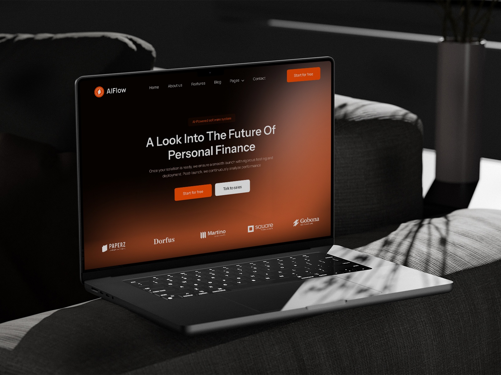
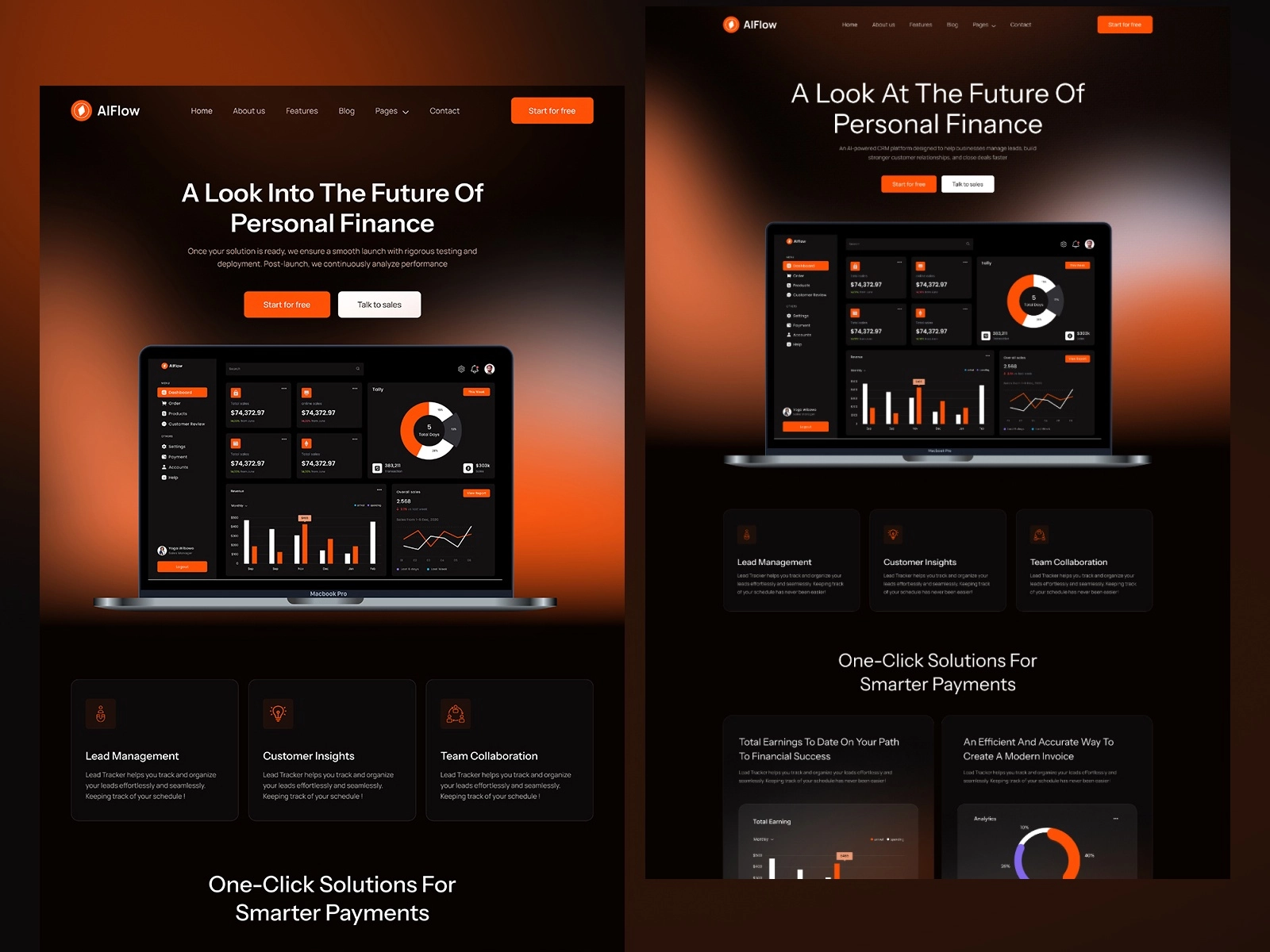
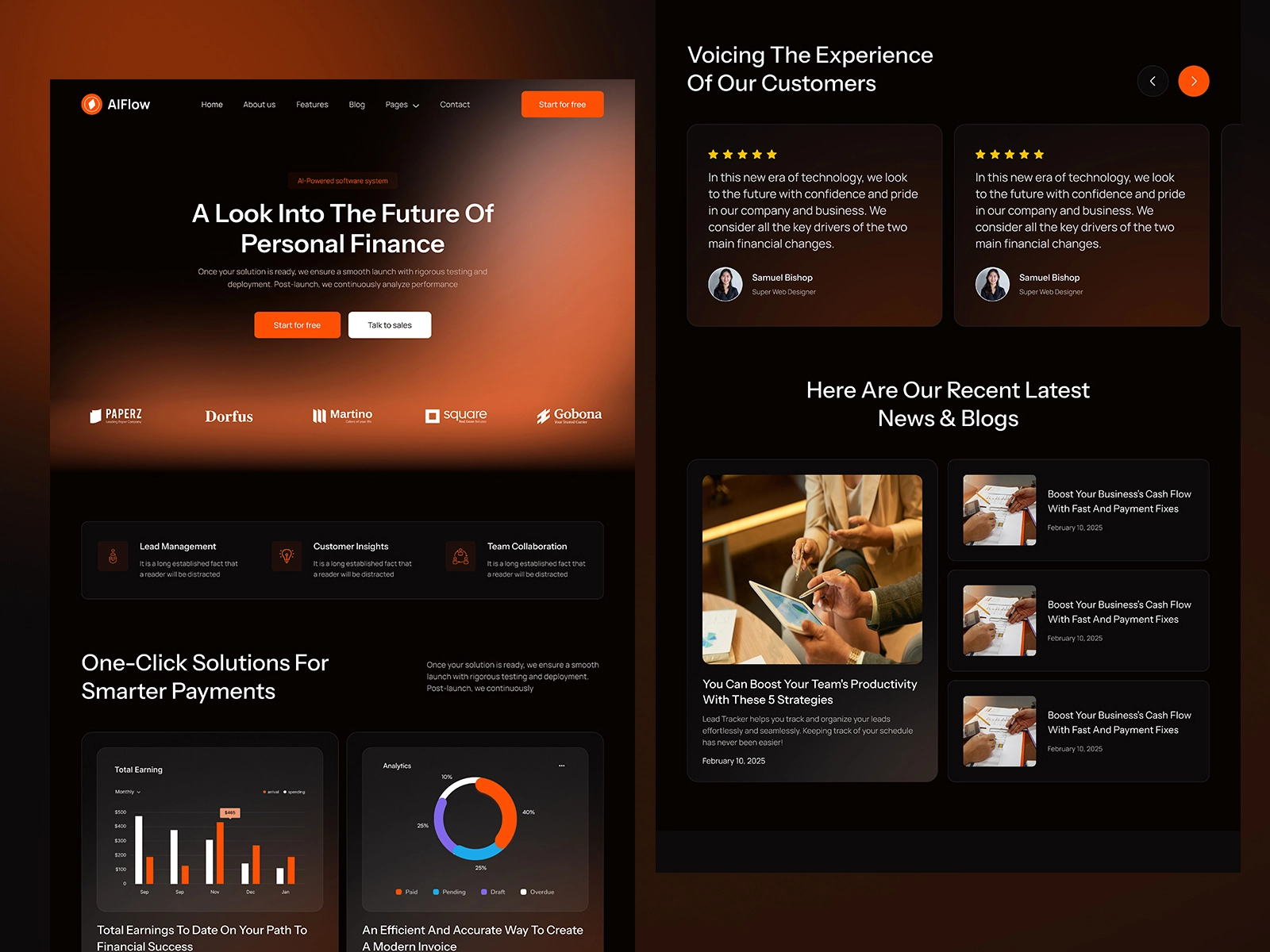
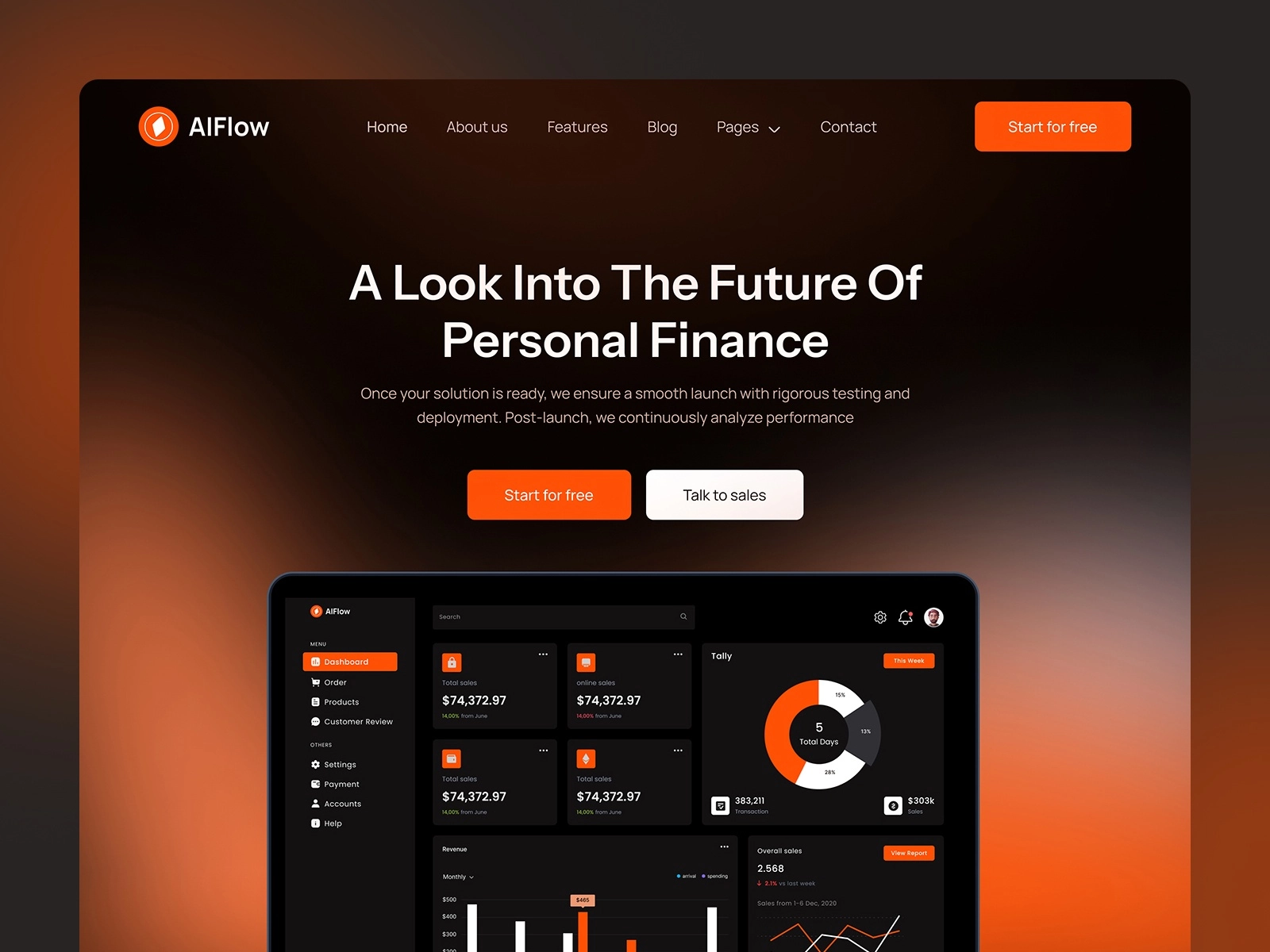
We redesigned the marketing website for a European fintech SaaS company. Their original site was overloaded with technical jargon and complex structure, making it hard for users to quickly grasp the product’s value. Our task was to simplify the user journey, update the visual identity, and focus the entire experience around clarity and trust. The new site uses bold typography, clean layouts, and a clear information hierarchy to communicate the core product benefits in just a few scrolls. Every section is designed to reduce friction — from homepage to pricing.
The main challenge was to communicate a complex fintech product to non-technical users — without oversimplifying it. We had to break down abstract features into clear blocks and guide the user step by step toward conversion, whether it's scheduling a demo or starting a free trial.
The final result is a sleek, focused website that delivers the product message with precision. Bounce rate dropped, and demo signups increased in the first month after launch. The structure is now modular, which makes future updates easier for the internal team. The design feels sharp and confident — exactly what a B2B fintech brand needs.
